---
title: Use your Android XML themes in Jetpack Compose
description: A step-by-step guide on using your Android XML themes in Jetpack Compose, using Compose Unstyled.
social_image: /og_xml_themes.png
---
Use this guide when migrating an Android app that still gets design values from XML themes. It lets you avoid
maintaining XML and Jetpack Compose theme values separately during the migration.
This guide teaches you how to setup your Compose Unstyled theme using your Android XML theme, and use its values in your
composables.
For the following guide, we will use this typical theme as a reference:
```xml expandable
```
## Create your Compose theme
First off, let's create a Compose theme. It will be 'blank' for now. In the next steps it will be used as the bridge
between XML
and Compose.
Compose Unstyled comes with a theme builder function called `buildThemeV2 {}`. It returns a theme that you can invoke
as a composable to wrap your application content.
If you are coming from Material Compose, the result of `buildThemeV2 {}` works the same way as Material's [
`MaterialTheme {}`](https://composables.com/docs/androidx.compose.material3/material3/components/MaterialTheme) function.
Let's create a blank theme and use it to wrap the contents of our app:
```kotlin expandable
import com.composeunstyled.UnstyledButton
import androidx.compose.foundation.text.BasicText
import com.composeunstyled.theme.buildThemeV2
val AppTheme = buildThemeV2 { }
@Composable
fun App() {
AppTheme {
Column(
modifier = Modifier.fillMaxSize(),
verticalArrangement = Arrangement.Center,
horizontalAlignment = Alignment.CenterHorizontally
) {
BasicText("Hello Styled World!")
UnstyledButton(
onClick = { },
contentPadding = PaddingValues(horizontal = 12.dp, vertical = 8.dp),
shape = RoundedCornerShape(100)
) {
BasicText("Click Me")
}
}
}
}
```
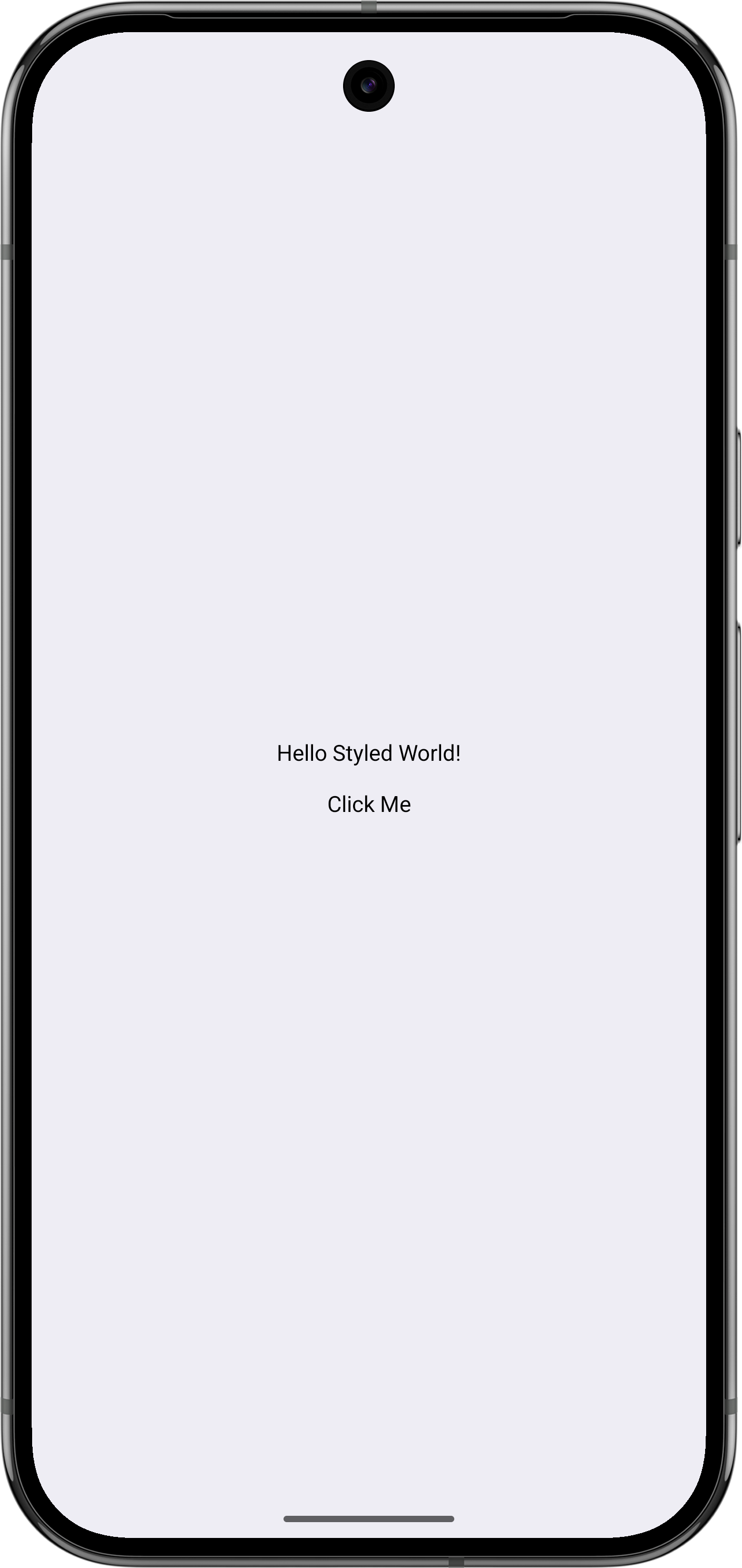
This example applies the theme but has not connected any XML values yet. The following sections map XML values to theme
tokens, which your components can then read with `Theme`.
## Use your XML colors in Compose
Now let's connect the XML world to the Jetpack Compose world.
Compose Unstyled comes with a `Theme` object, which is how you can reference values from the current theme. This is
similar to Material's `MaterialTheme` object, but in our case it's way more flexible.
Let's create a **colors** `ThemeProperty` and put some color `ThemeTokens` to it. We will use these tokens to populate
our theme and style our app:
```kotlin expandable
val colors = ThemeProperty("colors")
val background = ThemeToken("background")
val onBackground = ThemeToken("onBackground")
val primary = ThemeToken("primary")
val onPrimary = ThemeToken("onPrimary")
```
We can now use them in our theme function to read the values of our XML theme.
Compose Unstyled comes with `resolveThemeX()` composable functions so that you can read your XML theme values:
```kotlin expandable
val AppTheme = buildThemeV2 {
// get a reference to the calling (themed) context
val context = LocalContext.current
// map your XML colors to Compose
properties[colors] = mapOf(
background to resolveThemeColor(context, R.attr.color_background),
onBackground to resolveThemeColor(context, R.attr.color_onBackground),
primary to resolveThemeColor(context, R.attr.color_primary),
onPrimary to resolveThemeColor(context, R.attr.color_onPrimary),
)
}
```
> **Note:** Compose Unstyled does not inflate any XML themes for you. The `resolveThemeX()` functions map the given
> context's theme attributes
> to Compose's. The `LocalContext` references the context from which you will call `AppTheme` from. For example, if you
> call it from your Activity's `setContent {}` function, it will inherit the `android:theme` of your
_AndroidManifest.xml_
> file.
We can now use our XML theme colors directly in Compose.
To access them, use the `Theme` object like this:
```kotlin expandable
@Composable
fun App() {
AppTheme {
Column(
modifier = Modifier
.fillMaxSize()
.background(Theme[colors][background]),
verticalArrangement = Arrangement.Center,
horizontalAlignment = Alignment.CenterHorizontally
) {
ProvideContentColor(Theme[colors][onBackground]) {
BasicText("Hello Styled World!")
UnstyledButton(
onClick = {},
backgroundColor = Theme[colors][primary],
contentColor = Theme[colors][onPrimary],
contentPadding = PaddingValues(horizontal = 12.dp, vertical = 8.dp),
shape = RoundedCornerShape(100)
) {
BasicText("Click Me")
}
}
}
}
}
```
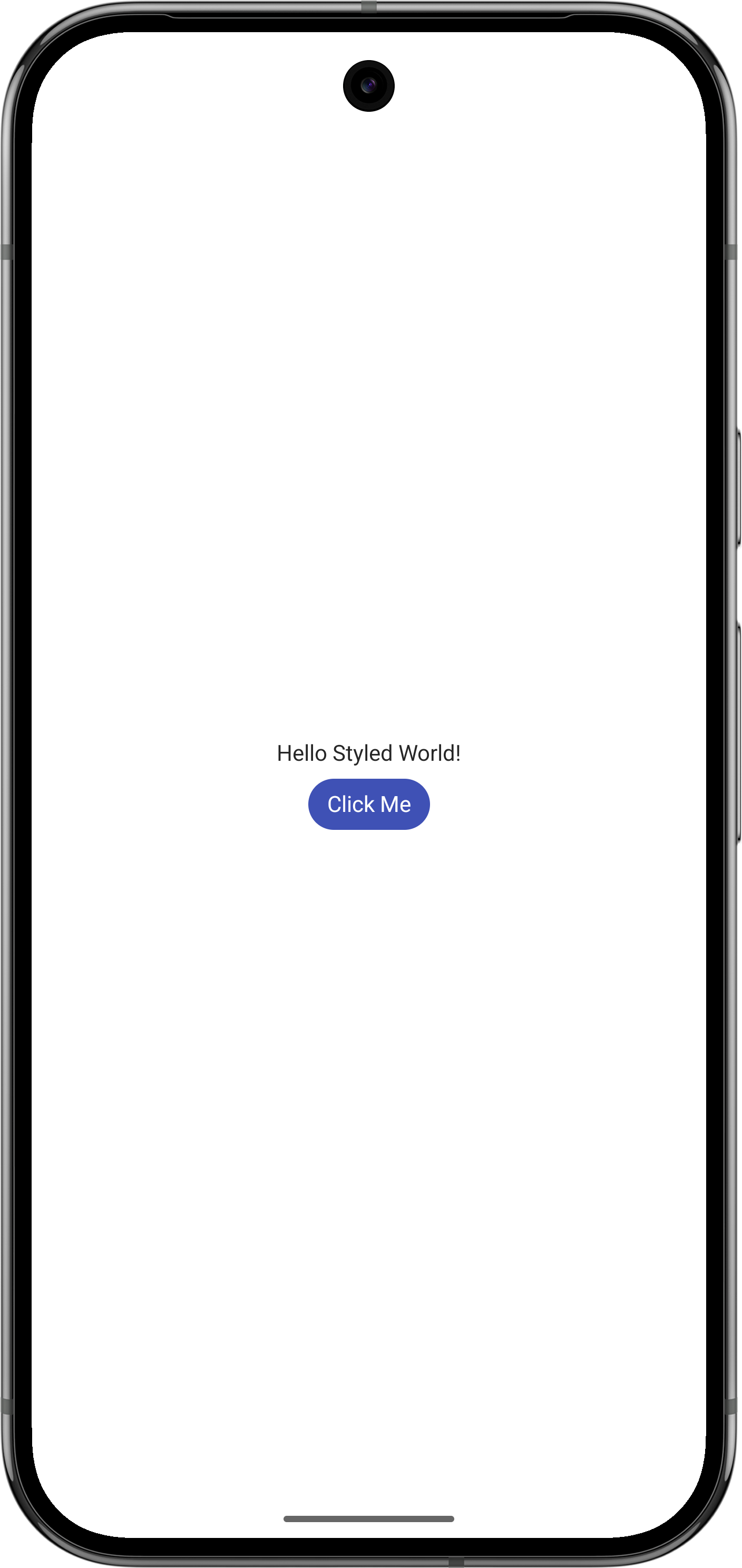
Brief explanation of the above code:
- `Theme[colors][background]` returns the `background` token of the `colors` property. Similarly for `onBackground`,
`primary` and `onPrimary`.
- The `ProvideContentColor()` function forwards the given `Color` to its children to render their contents with.
- The `Text` composable inherits the content color passed from the `ProvideContentColor` and renders its text using the
`onBackground` color of our theme.
- We want our button to use the primary/onPrimary combo of the theme, so we use its `backgroundColor` and `contentColor`
properties.
That's it. Now whenever you update your colors in your XML theme, the changes will be reflected in your composables.
## Use your XML dimens in Compose
Let's create some theme tokens for our spacing theme attributes, like we did for our colors:
```kotlin expandable
val spacing = ThemeProperty("spacing")
val small = ThemeToken("small")
val medium = ThemeToken("medium")
val large = ThemeToken("large")
```
and now let's map them to our theme:
```kotlin expandable
val AppTheme = buildThemeV2 {
// get a reference to the calling (themed) context
val context = LocalContext.current
// map your XML colors to Compose
properties[colors] = mapOf(
background to resolveThemeColor(context, R.attr.color_background),
onBackground to resolveThemeColor(context, R.attr.color_onBackground),
primary to resolveThemeColor(context, R.attr.color_primary),
onPrimary to resolveThemeColor(context, R.attr.color_onPrimary),
)
// map your XML dimens to Compose
properties[spacing] = mapOf(
small to resolveThemeDp(context, R.attr.spacing_small),
medium to resolveThemeDp(context, R.attr.spacing_medium),
large to resolveThemeDp(context, R.attr.spacing_large),
)
}
```
We can now use our spacing inside our app, using `Theme[spacing][small]`, `Theme[spacing][medium]` and
`Theme[spacing][large]`.
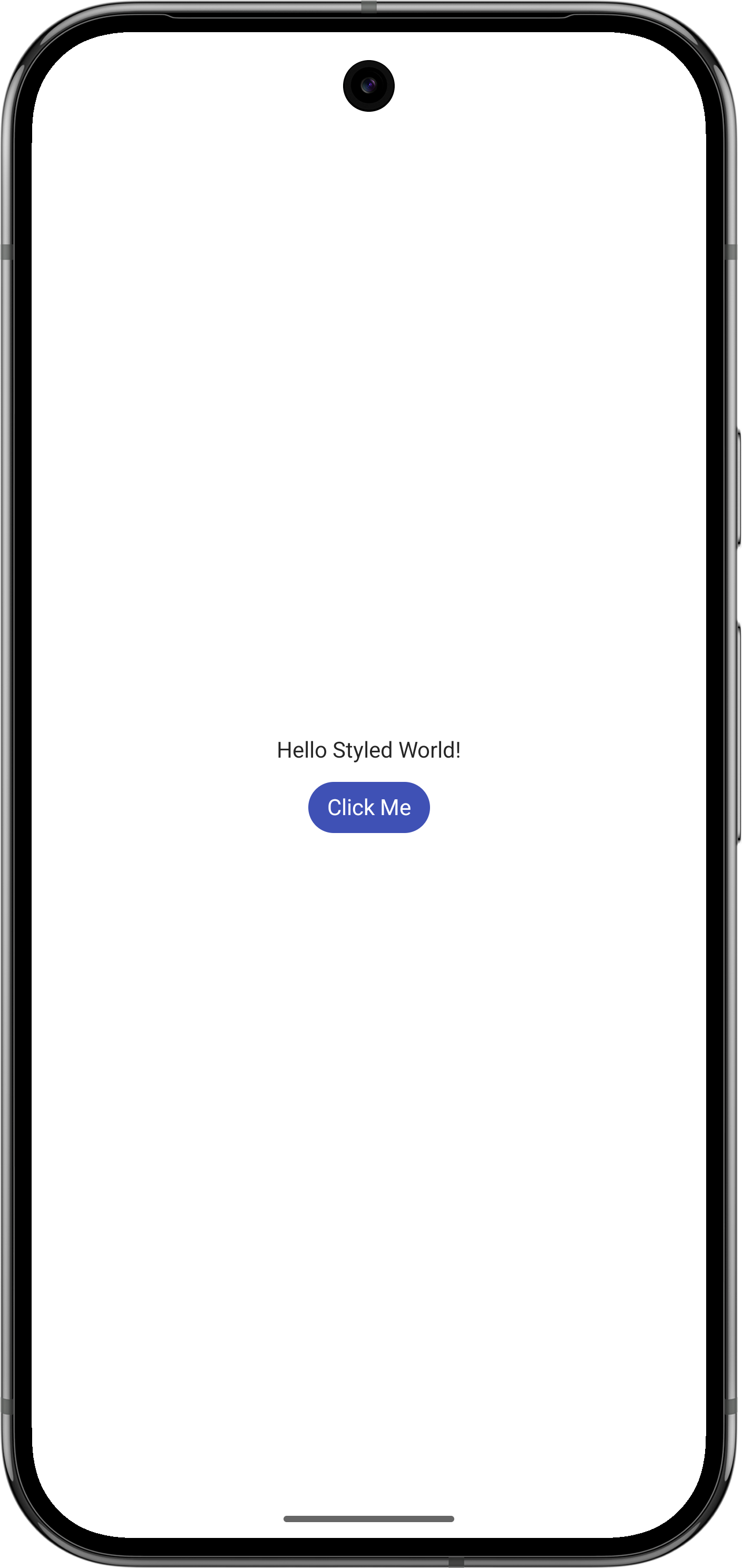
For our example let's put some spacing between our elements using a `Spacer`:
```kotlin expandable
@Composable
fun App() {
AppTheme {
Column(
modifier = Modifier
.fillMaxSize()
.background(Theme[colors][background]),
verticalArrangement = Arrangement.Center,
horizontalAlignment = Alignment.CenterHorizontally
) {
ProvideContentColor(Theme[colors][onBackground]) {
BasicText("Hello Styled World!")
Spacer(Modifier.height(Theme[spacing][large]))
UnstyledButton(
onClick = {},
backgroundColor = Theme[colors][primary],
contentColor = Theme[colors][onPrimary],
contentPadding = PaddingValues(horizontal = 12.dp, vertical = 8.dp),
shape = RoundedCornerShape(100)
) {
BasicText("Click Me")
}
}
}
}
}
```
## Use your XML typography in Compose
Let's create theme tokens for our text appearance attributes:
```kotlin expandable
val typography = ThemeProperty("typography")
val body = ThemeToken("body")
```
Now we can map our XML text appearance to our theme tokens using `resolveThemeTextAppearance`:
```kotlin expandable
val AppTheme = buildThemeV2 {
// get a reference to the calling (themed) context
val context = LocalContext.current
// map your XML colors to Compose
properties[colors] = mapOf(
background to resolveThemeColor(context, R.attr.color_background),
onBackground to resolveThemeColor(context, R.attr.color_onBackground),
primary to resolveThemeColor(context, R.attr.color_primary),
onPrimary to resolveThemeColor(context, R.attr.color_onPrimary),
)
// map your XML dimens to Compose
properties[spacing] = mapOf(
small to resolveThemeDp(context, R.attr.spacing_small),
medium to resolveThemeDp(context, R.attr.spacing_medium),
large to resolveThemeDp(context, R.attr.spacing_large),
)
// map your XML typography to Compose
properties[textStyles] = mapOf(
body to resolveThemeTextAppearance(context, R.attr.textStyle_body),
)
}
```
Now you can use your XML typography in your composables using the new tokens and the `ProvideTextStyle` composable:
```kotlin expandable
@Composable
fun App() {
AppTheme {
Column(
modifier = Modifier
.fillMaxSize()
.background(Theme[colors][background]),
verticalArrangement = Arrangement.Center,
horizontalAlignment = Alignment.CenterHorizontally
) {
ProvideTextStyle(Theme[textStyles][body]) {
ProvideContentColor(Theme[colors][onBackground]) {
BasicText("Hello Styled World!")
Spacer(Modifier.height(Theme[spacing][large]))
UnstyledButton(
onClick = {},
backgroundColor = Theme[colors][primary],
contentColor = Theme[colors][onPrimary],
contentPadding = PaddingValues(horizontal = 12.dp, vertical = 8.dp),
shape = RoundedCornerShape(100)
) {
BasicText("Click Me")
}
}
}
}
}
}
```
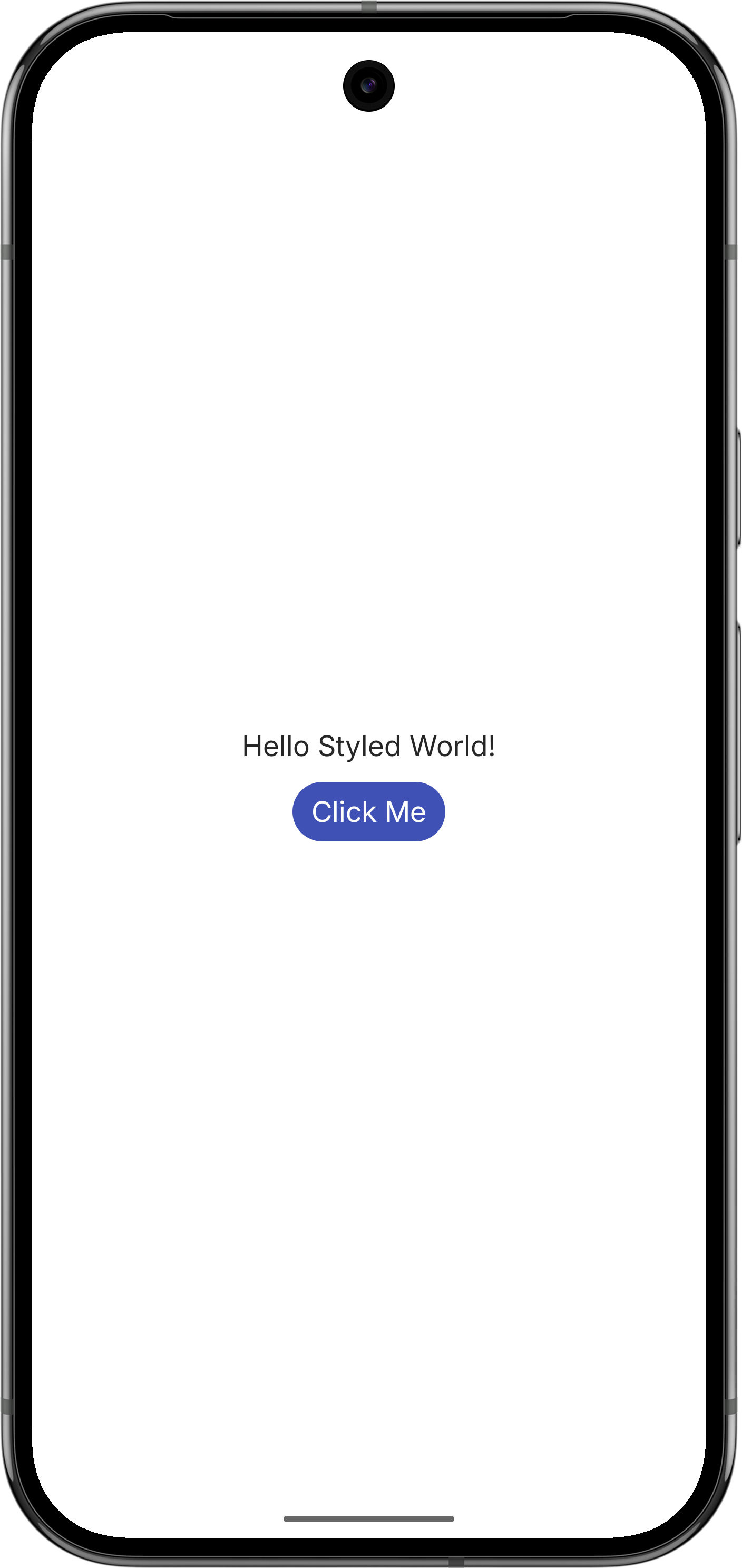
The `resolveThemeTextAppearance` function automatically resolves:
- Font size (`android:textSize`)
- Font family (`android:fontFamily`) including custom fonts
- Font weight and style (`android:textStyle`)
- Text color (`android:textColor`)
- Text shadows (`android:shadowColor`, `android:shadowDx`, `android:shadowDy`, `android:shadowRadius`)
## Use the Material Ripple effect in Compose
The Material ripple is a signature of Android apps, and we highly recommend using it in your apps for that polished
touch effect.
For this, we provide a Compose Ripple Indication library:
```kotlin title="app/build.gradle.kts"
implementation("com.composables:ripple-indication:1.0.0")
```
This introduces the `rememberRippleIndication()` function, that we can use in our compose theme:
```kotlin expandable
val AppTheme = buildThemeV2 {
// get a reference to the calling (themed) context
val context = LocalContext.current
// map your XML colors to Compose
val primary = resolveThemeColor(context, R.attr.color_primary)
// create a ripple effect using the primary color
defaultIndication = rememberRippleIndication(
color = primary
)
properties[colors] = mapOf(
background to resolveThemeColor(context, R.attr.color_background),
onBackground to resolveThemeColor(context, R.attr.color_onBackground),
primary to primary,
onPrimary to resolveThemeColor(context, R.attr.color_onPrimary),
)
// map your XML dimens to Compose
properties[spacing] = mapOf(
small to resolveThemeDp(context, R.attr.spacing_small),
medium to resolveThemeDp(context, R.attr.spacing_medium),
large to resolveThemeDp(context, R.attr.spacing_large),
)
// map your XML typography to Compose
properties[textStyles] = mapOf(
body to resolveThemeTextAppearance(context, R.attr.textStyle_body),
)
}
```
and rerun the app:
---
## API Reference
### resolveThemeColor
| Parameter | Type | Description |
|-----------|------|-------------|
| `context` | `Context` | The Android Context to resolve attributes from |
| `resId` | `Int` | |
### resolveThemeDp
| Parameter | Type | Description |
|-----------|------|-------------|
| `context` | `Context` | The Android Context to resolve attributes from |
| `resId` | `Int` | |
### resolveThemeSp
| Parameter | Type | Description |
|-----------|------|-------------|
| `context` | `Context` | The Android Context to resolve attributes from |
| `resId` | `Int` | |
### resolveThemePx
| Parameter | Type | Description |
|-----------|------|-------------|
| `context` | `Context` | The Android Context to resolve attributes from |
| `resId` | `Int` | |
### resolveThemeInt
| Parameter | Type | Description |
|-----------|------|-------------|
| `context` | `Context` | The Android Context to resolve attributes from |
| `resId` | `Int` | |
### resolveThemeFloat
| Parameter | Type | Description |
|-----------|------|-------------|
| `context` | `Context` | The Android Context to resolve attributes from |
| `resId` | `Int` | |
### resolveThemeString
| Parameter | Type | Description |
|-----------|------|-------------|
| `context` | `Context` | The Android Context to resolve attributes from |
| `resId` | `Int` | |
### resolveThemeBoolean
| Parameter | Type | Description |
|-----------|------|-------------|
| `context` | `Context` | The Android Context to resolve attributes from |
| `resId` | `Int` | |
### resolveThemeTextAppearance
| Parameter | Type | Description |
|-----------|------|-------------|
| `context` | `Context` | The Android Context to resolve attributes from |
| `resId` | `Int` | |